JPMORGANCHASE

Evolving the Chase offer experience on Mobile Home
Industry
Finance
Team
Research lead
3 Product partners
Design project advisor
Role
Design lead
Timeline
12 months, 2024

estimated Impact sizing
50k↑
incremental accounts*
$53M↑
NPV annually*
Context
Chase mobile app has emerged as a primary account driver, with +43% growth in app production over 2 years.
The Chase mobile app servers +80 million customers to manage financial products and open new accounts.
Problem
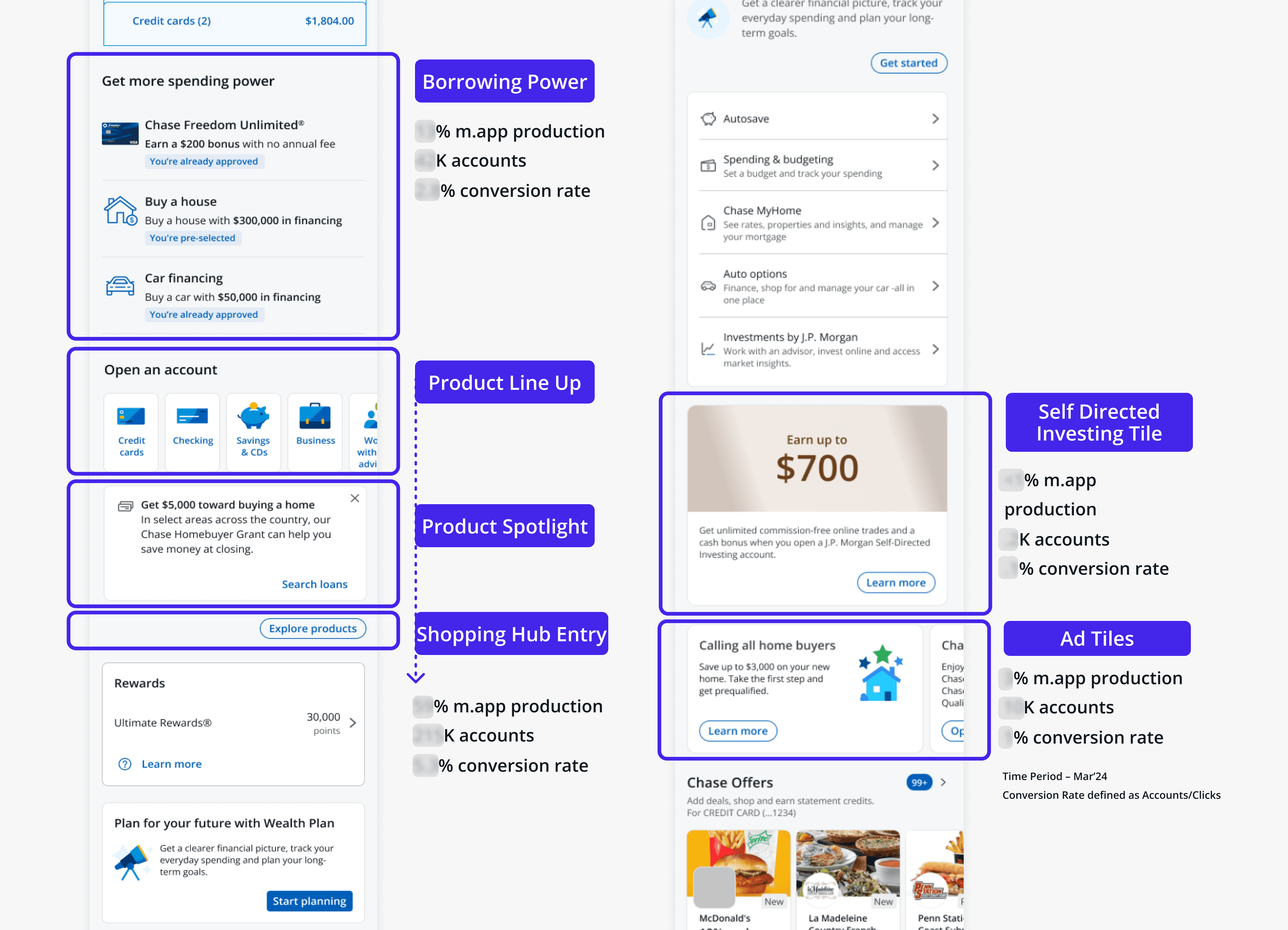
There are currently 5+ different styles of acquisition entry points on the homepage
Orchestration, disparate LOB ownership, and disjointed offer engines lead to a lack of cohesion and redundancy in offers.

PRELIMINARY research
Customers see the offer experience as disjointed and impersonal
I partnered with a researcher to facilitate interviews with 12 Chase customers to understand current perceptions and co-design concepts.
💬
“It doesn’t feel organized it feels disjointed... you have different subjects… It's all over the place. I would like to keep those encapsulated in one area.”
💬
“I would expect the offers to be related, or pre-approved, since the bank already knows my financial situation very well, better than myself. I don't wanna waste my time for something that I might not qualify for.”


EXPLORATION & stakeholder prioritization
Relevancy cues, control, and better guidance emerged as priorities through rapid concepting
The scope of this effort was ambiguous. I generated a broad range of concepts and lead a prioritization workshop with stakeholders to hone in on directions to pursue.
Lo-fi CONCEPT evalutation
Offers should feel like personalized support from a trusted advisor, not just ads
We evaluated the prioritized concepts with 8 Chase customers and learned three key insights.
1
Tailor featured offers to best reflect what we know about our customers.
2
Enable customers to organize their offers by product types that meet their needs
3
Offer control and input to build trust and confidence in recommendations
💬
"Having a descriptor of why it’s applicable to me gives me the impression there is some sort of consideration of me, its a good starting point.”

hi-fi refinement
Exploring a visual system for offer styles
Building on the low-fi winning concepts, I elevated the fidelity exploring visual treatments with our design system and new patterns to push the boundaries of existing templates across offer types.


Redesign vision
A consolidated, personalized hub to connect customers with relevant offers
I aggregated the strongest concepts from research and design explorations into a final design concept recommendation
→
Offers organized by product
→
Personalized spending insights
→
Tooltips to contextualize relevance
→
Access point to all offers
results
In progress
The redesign vision helped uncover significant architecture dependencies and expedite replatforming efforts from leadership
As we ciruculated the design recommendations, we were met with unforseen technical constraints that paused the project in order to prioritze underlying product dependencies. The design effort resulted in greatly expediting the priority of these initiatives from leadership.
Outcomes

1
Connecting recommendation engines with shopping services for interaction between independent offer tiles

2
Extending personalization capabilities to offers, leveraging P&I models to determine insights based on a customer’s behaviors to enhance relevancy.
3
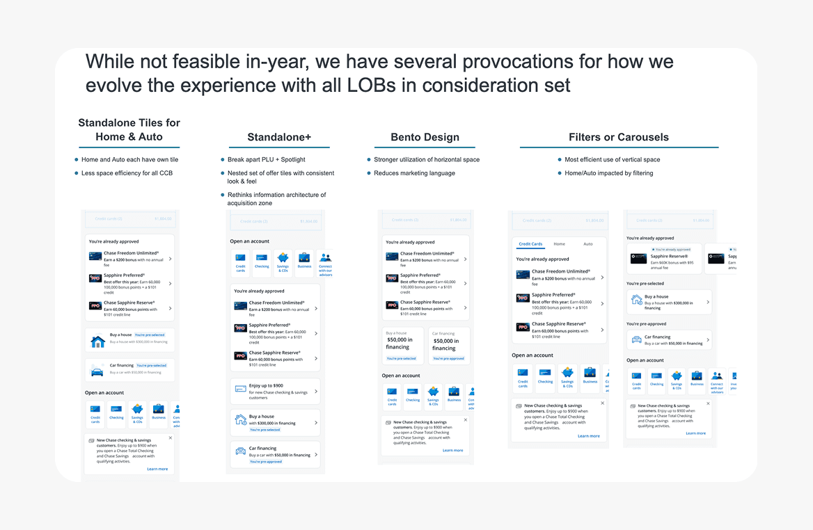
Experimenting with subcomponents of the vision to incrementally test into the redesign, such as categorizing offers by line of business
Reflection
Pivots happen!
Build in time for alignment early to clarify scope and objectives, right size exploratory concepts to bridge the gap from research to delivery and create adaptable learnings and explorations that can evolve with inevitable shifts.


